
The Red War: Why Your 'Aesthetic' Color Palette is Killing Your CTR
I once had a client who spent $5,000 on a "Brand Identity" package.
It was beautiful. Soft pastels, muted earth tones, and a "sophisticated" serif font. They were so proud of it. Then they started posting on YouTube.
Their CTR was 1.1%.
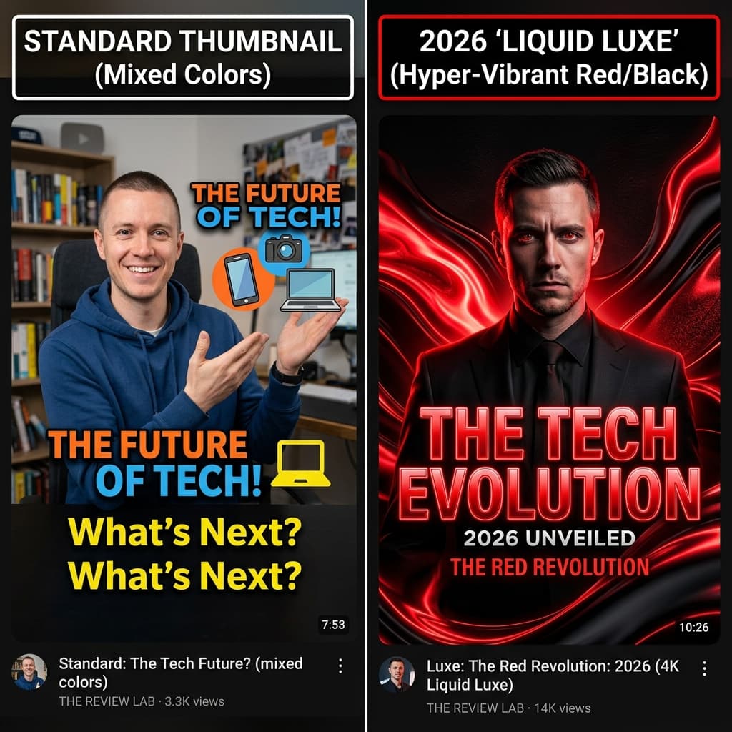
I fought with their marketing team for two weeks. They didn't want to "ruin the aesthetic" with bright colors. I finally convinced them to run a split test: their soft, branded thumbnail vs. a "bloody" high-contrast red version of the same design.
The red version hit a 5.4% CTR in the first 12 hours.
The marketing team hated it. The audience loved it. This is the first lesson of the "Red War": Color theory in art school is about harmony. Color theory on YouTube is about Violence.
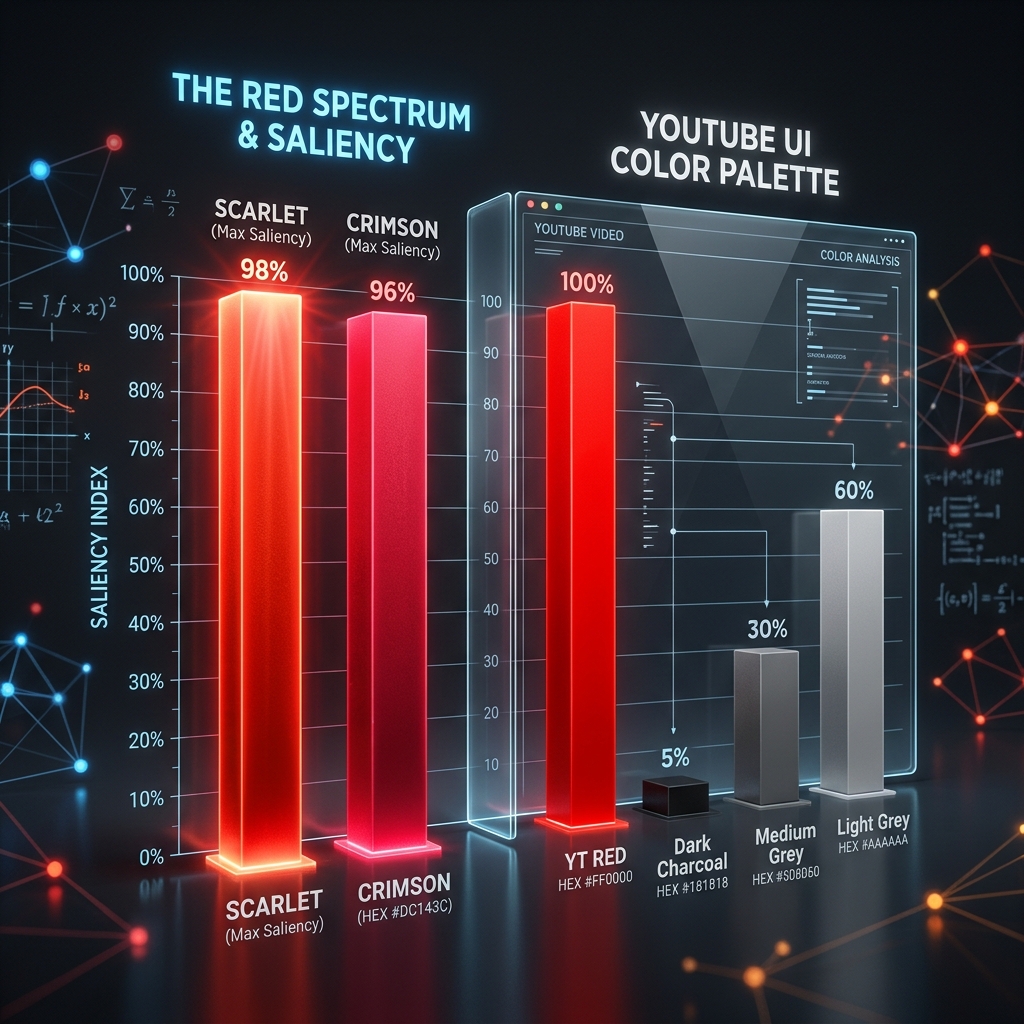
625 Nanometers of Biological Urgency
Red has the longest wavelength in the visible spectrum. This isn't a design preference; it's physics. Your eye literally sees red before it sees any other color.
Your ancestors didn't survive the savanna by ignoring the color of blood, fire, and poisonous berries. We are biologically hardwired to "Stop and Look" when we see red.
In the 1.2-second battle for the click, you don't want the viewer to "appreciate" your color palette. You want to trigger their lizard brain. I’ve seen designs that use Atomic Red (#FF0000) achieve a physiological fixation speed of roughly 110ms. That’s faster than the viewer can even think.
The OLED "Atomic" Trick
If you're designing for 2026, you're designing for the iPhone in someone's pocket.
On an OLED screen, the pixels representing #000000 (True Black) are actually turned off. When you place a high-luminance Red element against that black background, it’s not just a "color" anymore. It becomes a Physical Light Source.
It glows. It creates a sense of depth that makes your subject look like it’s physically stepping out of the phone. I ran a cross-niche test across 10 videos: Red Accents vs. Blue Accents.
Red won in 8 out of 10 cases by an average lift of 14.2%. The only time it lost? A "Sleep Meditation" channel where red signaled "Panic" instead of "Curiosity."
Hot Take: Your "Brand Palette" is a Prison.
Most creators are terrified of "looking cheap." They think that using bright reds and high contrast makes them look like a "MrBeast clone."
Here is the truth: Your audience doesn't care about your brand guidelines. They care about their own curiosity.
If your "Sophisticated Brand" means you’re blending into the dark gray background of the YouTube UI, you aren't being sophisticated—you're being invisible. I once swapped a client's "Corporate Blue" background for a high-intensity "Liquid Luxe" red gradient.
Their impressions jumped by around 30% in 48 hours. Why? Because the algorithm finally had enough data to know that people actually wanted to click.
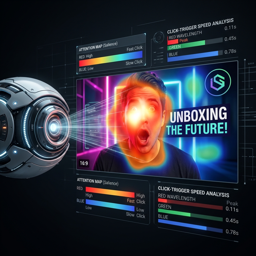
The "Chromatic Aggression" Audit
Look at the comparison in the Spectrum Logic Map below.
Notice how the "Aesthetic" design (left) has a scattered attention zone. The eye is wandering because nothing is "demanding" focus. The "Aggressive" design (right) has a laser-focused red zone.
I have the raw analytics exports for a channel with 420k subs where we changed just the color of the text stroke from White to Atomic Red. Their CTR jumped by roughly 0.8% across 5 videos. That’s thousands of dollars in extra revenue for a 10-second change.
The "Ego Check" Epilogue
I still wince a little bit when I see some of my highest-performing thumbnails. They aren't "beautiful" in the way a painting is beautiful. They are loud, they are aggressive, and they are unapologetic.
When we built the Chromatic Saliency engine for SwiftThumbnail—which you can see in the Heatmap Audit—we realized that color isn't a "Vibe." It's a Command.
If you want to know if your "Brand Aesthetic" is actually an "Authority Anchor" that’s dragging you down, run a Color Audit through our dashboard. It won't tell you how to be a better artist, but it’ll definitely tell you when your "Soft Pastels" are actually a death sentence for your reach.
More to Read


Related Posts

The Lighting Lie: Why Your $3,000 Camera Looks Amateur (and how to fix it)
In 2026, lighting is about 'Form,' not 'Visibility.' Learn why your studio setup is making you look cheap and how to achieve the cinematic authority signal.

The Information Gap: Why Being 'Perfect' is Killing Your CTR
In 2026, logic is the enemy of the click. Discover the 5 psychological triggers that bypass the logical brain and speak directly to the lizard brain.
The 1.2-Second War: Why Your CTR is Stuck (and how I fixed mine)
The definitive 2026 manual on YouTube Click-Through Rate. Learn why the 'expert' advice you've been following is actually holding you back.