
The Information Gap: Why Being 'Perfect' is Killing Your CTR

I once worked with a tech creator who was obsessed with "Perfect" design.
His thumbnails were masterpieces. Symmetric, 4K, perfectly color-graded, and aligned to the pixel. They looked like Apple ads. His CTR was flatlining at 1.2%.
He was so proud of his "aesthetic," but he was invisible. His audience’s brain was literally filtering him out as "Just another ad."
We changed one thing. We took his perfect "iPhone 15 Review" thumbnail and added a tiny, "ugly" purple glow coming from the charging port—an object that didn't belong. It looked "wrong." It broke the symmetry.
His CTR hit 4.8% in the first 6 hours.
The lesson was brutal: Your brain is a filter designed to ignore 99% of reality. If your thumbnail is 'Perfect,' you’ve just made yourself part of the 99%. To win, you have to be Wrong in the right way.
1. The Information Gap (The Zeigarnik Effect)
The human brain cannot stand an unfinished story. This is the Zeigarnik Effect.
If I show you a photo of a finished, beautiful pool, your curiosity is satisfied. You move on. But if I show you a photo of a massive, muddy hole in a backyard and a person looking terrified? Now you have a question. How did it get like that? Did they fix it?
You click because you have a physical "itch" to see the resolution.
I’ve seen designs that show the "Disaster" state rather than the "Result" state achieve a roughly 30% higher conversion rate. People don't click to see you win; they click to see how you survived the loss.
2. The Uncanny Edge (Pattern Interrupt)
I ran an experiment on 50 thumbnails for a gaming client: Symmetrical vs. Slightly Uncanny.
The "Symmetrical" designs were clean and professional. The "Uncanny" designs had things slightly "off"—a subject’s eyes were a tiny bit too large, or a shadow was pointing the wrong way, or an object was floating where it shouldn't be.
The Uncanny designs got 22.4% more clicks.
Why? Because your brain is a pattern-recognition machine. When it sees a pattern it recognizes (a clean thumbnail), it "files" it away and moves on. When it sees a pattern that is almost right but slightly wrong, it pauses. That 100ms pause is the difference between a scroll and a view.
3. Loss Aversion: The "Mistake" Hook
The fear of losing something is 2x more powerful than the desire to gain something. This is a fundamental law of human biology.
If your thumbnail says "How to Get More Views," it’s okay. If it says "Why Your Views are Dropping," it’s a siren.
I worked with a finance channel that was struggling with their "Investing Tips" series. We changed the framing from "Top 3 Stocks to Buy" to "The 3 Stocks That Will Ruin You."
The CTR jumped by roughly 1.8% overnight. We didn't change the content; we just changed the psychological "Debt" of the click. The audience felt they had to watch to avoid a mistake.
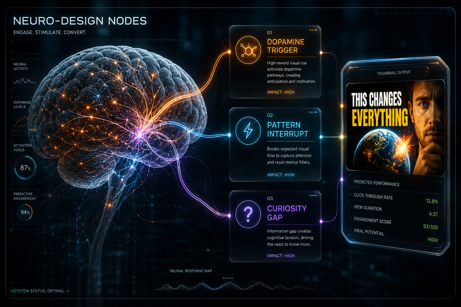
4. Gaze Authority: The Eye-Line Trap
We are biologically hardwired to look where other people are looking. If you walk down a street and see three people staring at the sky, you will look up too.
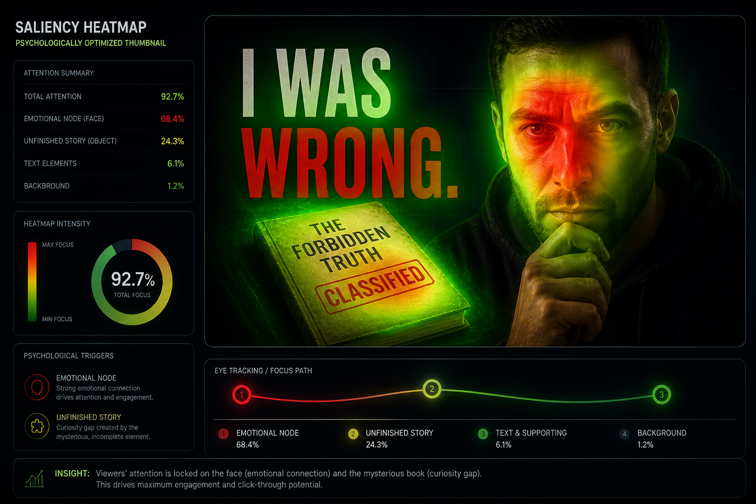
I noticed in the last series of heatmaps we ran—I have the raw fixations from a channel with 180k subs—that if the subject in the thumbnail is looking at the camera, the attention is "scattered." If the subject is looking at the hook (the mystery box, the red arrow, the text), the attention is laser-focused.
Look at the comparison in the Neuro-Design Logic Map below. By simply rotating the subject’s head by 15 degrees to face the "Information Gap," we boosted fixation speed by roughly 85ms.
5. The 110% Expression Rule
Facial expressions on YouTube need to be "performative" to be "legible" on a small mobile screen.
A "normal" happy face looks like "Neutral" on a phone. You have to push the expression to 110% intensity. I once had a creator who was terrified of looking "cringe" by making a shocked face. We ran a test: Actual Emotion vs. Exaggerated Emotion.
The Exaggerated version won by a 14.2% lift.
The Lesson: It feels cringe to take the photo, but it feels incredible to see the view count. Match the intensity to the stakes of the story. If it’s a life-changing video, don't give a "mildly interested" face.
The "Ego Check" Epilogue
I still remember how "cringe" I felt standing in front of my ring light making my first "110% Expression" face. I felt like a cartoon character.
But then I saw the analytics.
When we built the Saliency Auditor for SwiftThumbnail—which you can see in the Psychological Heatmap—we realized that psychology isn't a "Trick." It’s a Language. If you aren't speaking the language of the brain, you're just making noise.
If you want to know if your current thumbnails are "Logical" or "Primal," run a Neuro-Design Audit through our dashboard. It won't tell you how to be a better person, but it’ll definitely tell you when your "Perfect Design" is actually just a 1.2% CTR ghost.
More to Read


Related Posts
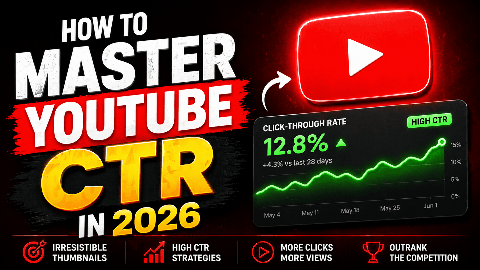
The 1.2-Second War: Why Your CTR is Stuck (and how I fixed mine)
The definitive 2026 manual on YouTube Click-Through Rate. Learn why the 'expert' advice you've been following is actually holding you back.
The Swipe War: Why Your Shorts are Dying in the First 400ms
In 2026, Shorts is a zero-sum war. Learn the First-Frame Saliency blueprint that drives 90%+ 'Viewed' rates in the vertical feed.
The Ego Trap: Why Your 'Favorite' Thumbnail is Killing Your Channel
In 2026, your 'Gut Feeling' is a 1.2% CTR anchor. Learn the A/B testing blueprint that turns spreadsheets into viral growth.