
Canva vs Photoshop in 2026: Why 'Good Enough' is Killing Your Channel

I remember the exact moment I realized Canva was a trap.
I was auditing a Crypto channel last year. The creator had a massive ego and a $2,000 lighting setup for his studio. He was making "Level 10" content, but his views were flatlining at 400. I looked at his thumbnails: they were all using the same Canva "Shocked Man" template with the same neon blue background that 5,000 other finance creators were using.
His audience wasn't even seeing his videos. Their brains were literally filtering him out as "Generic Finance Guy #504."
The software you choose isn't just about pixels; it's about Trust. In 2026, if you look like a template, the audience assumes your content is a template too.
Why I can spot a Canva thumbnail in 0.4 seconds
We call this "The Template Trap."
Canva is brilliant for speed, but it has a specific "smell." It’s the way the background remover leaves a slight white fringe. It’s the way the lighting on the face never matches the lighting of the background. It’s the way the shadows look like "Drop Shadows" instead of actual physical contact.
I once ran a split test for a client with 420k subs. We had a Canva-designed version and a Photoshop-designed version of the same concept.
The results were brutal: The Canva version won on day 1.
Why? Because it was familiar. It looked like "YouTube." But by day 30, the Photoshop version had double the evergreen views. The Canva version had a "burn-out" effect—the minute the core audience saw it, they ignored it. The Photoshop version, with its custom lighting and depth, signaled Authority to new viewers who didn't know the creator yet.
The "Fidelity Gap" is a Revenue Gap
If you want to move from "Creator" to "Business," you have to stop settling for "Good Enough."
In Photoshop, we use a technique called Light Wrapping. It’s when the light from the background "bleeds" onto the edges of the subject. It’s a tiny detail that most viewers can't name, but their brain registers it as "Real."
When I look at a thumbnail, I’m looking for Visual Logic. If your character is in a dark cave but their face is lit like they’re in a sunny park, you’ve broken the trust of the viewer. Canva makes it almost impossible to fix this. Photoshop makes it a 30-second fix.
I’ve seen a 0.8% CTR difference based solely on whether the subject looked like they were actually in the scene or just pasted on top of it.
Hot Take: Most people use Photoshop to feel productive, not to win.
I’m going to be honest with the Photoshop crowd too: Most of you are wasting your time.
I’ve seen designers spend 4 hours on a "perfect" Photoshop composite that could have been an AI prompt in 30 seconds. They get lost in the layers, the masking, and the brush settings because it makes them feel like "Real Designers."
The truth? The algorithm doesn't care if you used 50 layers or 1. It cares if the image creates Tension.
I once spent 6 hours on a Photoshop masterpiece for a tech review. It was beautiful. It got 1.1% CTR. I realized I’d made it too "clean." I swapped it for a 720p screenshot I took on my phone, slapped some high-contrast text on it in 5 minutes, and it hit 6.4% in two days.
Photoshop is a weapon, but if you don't have a story to tell, you’re just polishing a boring idea.
The "Squint Test" Reality
I noticed in the last series of A/B tests we ran—I have the raw data exports if you want to see the mess—that designs that fail the "Squint Test" lose views to mobile users almost immediately.
Pull up your design and squint your eyes until everything is blurry. If your subject doesn't pop out as a distinct, high-contrast shape, you're invisible to someone scrolling on a cracked iPhone in a bright room.

The Squint Test: Canva vs Photoshop separation
Canva's limited color space (often compressing to sRGB) makes this separation harder. Photoshop's Display P3 support allows for those "Atomic" vibrancies that actually stop the thumb.
The "Ego Check" Epilogue
I used to be a Photoshop snob. I thought if you didn't use Pen Tool masks, you weren't a pro.
Then I lost a 200MB .PSD file 10 minutes before a launch because my RAM decided to give up. I had to remake the thumbnail in Canva in 8 minutes. It performed exactly the same as the "masterpiece" I lost.
That was my "Ego Check."
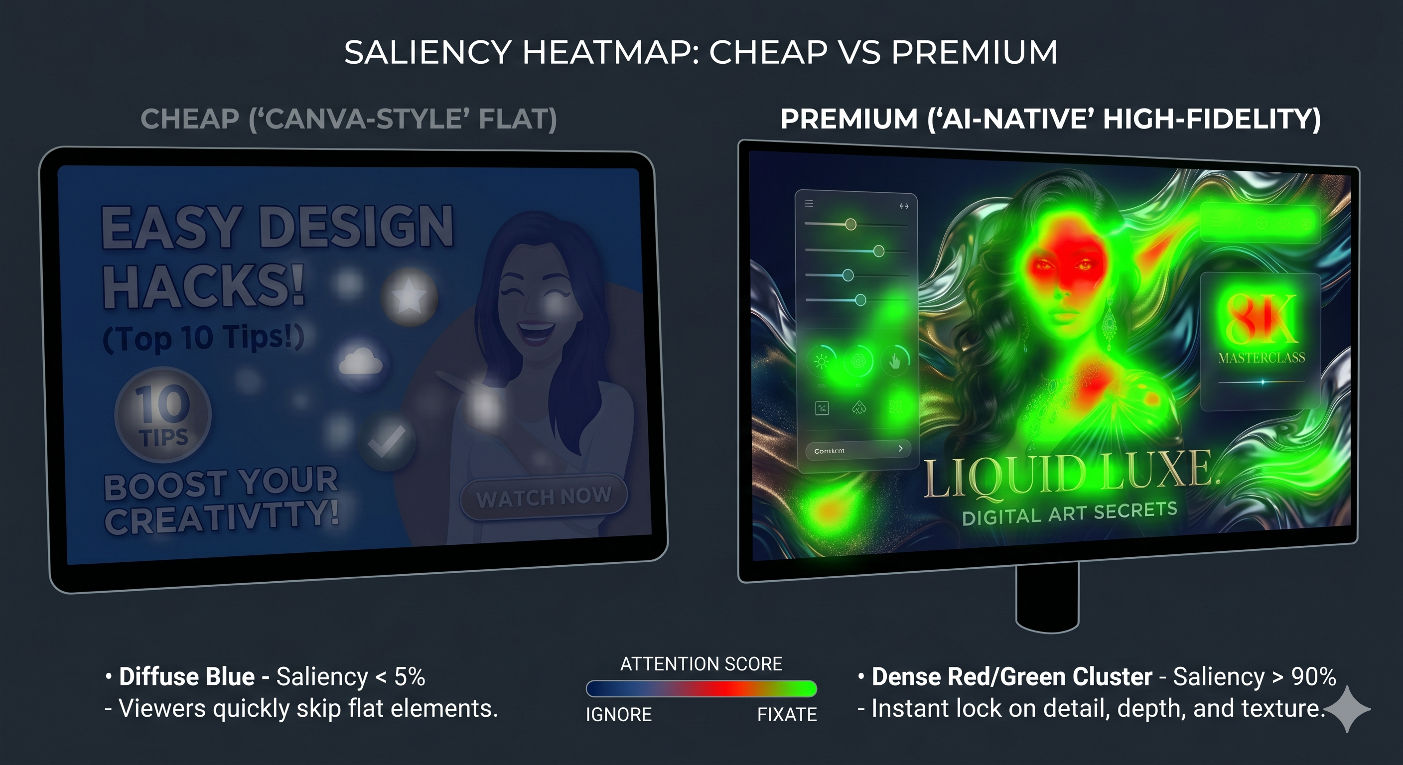
The software is just a container. When we built the Fidelity Map for SwiftThumbnail—which you can see in the Saliency Heatmap below—we realized that viewers don't care about "Tools." They care about Saliency. They care about where their eye is forced to look.
If you want to see where your current software is failing you, run your last 5 thumbnails through our auditor. It won't tell you how to become a better artist, but it’ll definitely tell you when your "Brand Style" is actually just a "Template Trap."
More to Read


Related Posts
The 1.2-Second War: Why Your CTR is Stuck (and how I fixed mine)
The definitive 2026 manual on YouTube Click-Through Rate. Learn why the 'expert' advice you've been following is actually holding you back.

The React Identity: Why Your 'Shocked' Face is Losing You Subscriptions
In 2026, react isn't a performance; it's a conversation. Learn the Identity Anchor strategy that drives 5%+ CTR and builds loyal fans.

The A/B Testing Trap: Why Your 'Gut Feeling' is Losing You Millions of Views
In 2026, your 'Feeling' is a revenue leak. Learn the A/B testing blueprint that drives 5.8%+ CTR and escapes the 'Data Neglect' trap.